Moving Data • An Interactive Installation to Find the Beauty in Data
00:00
00:00
00:00
Case Study
0:00
Transforming complex data into intuitive artwork.
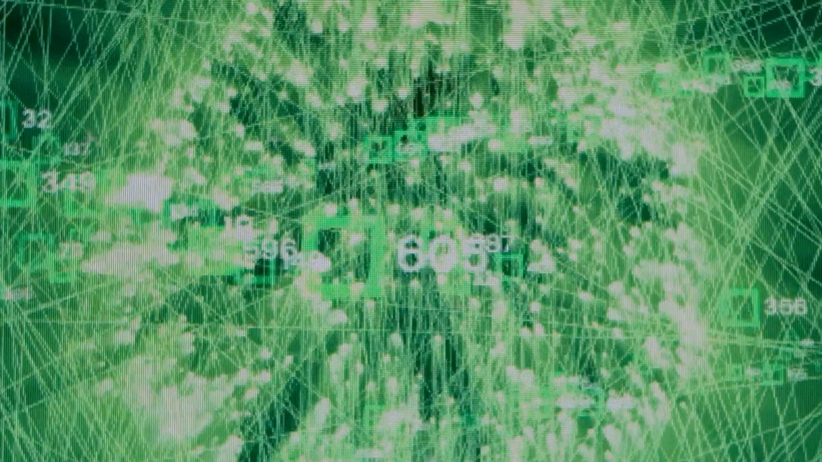
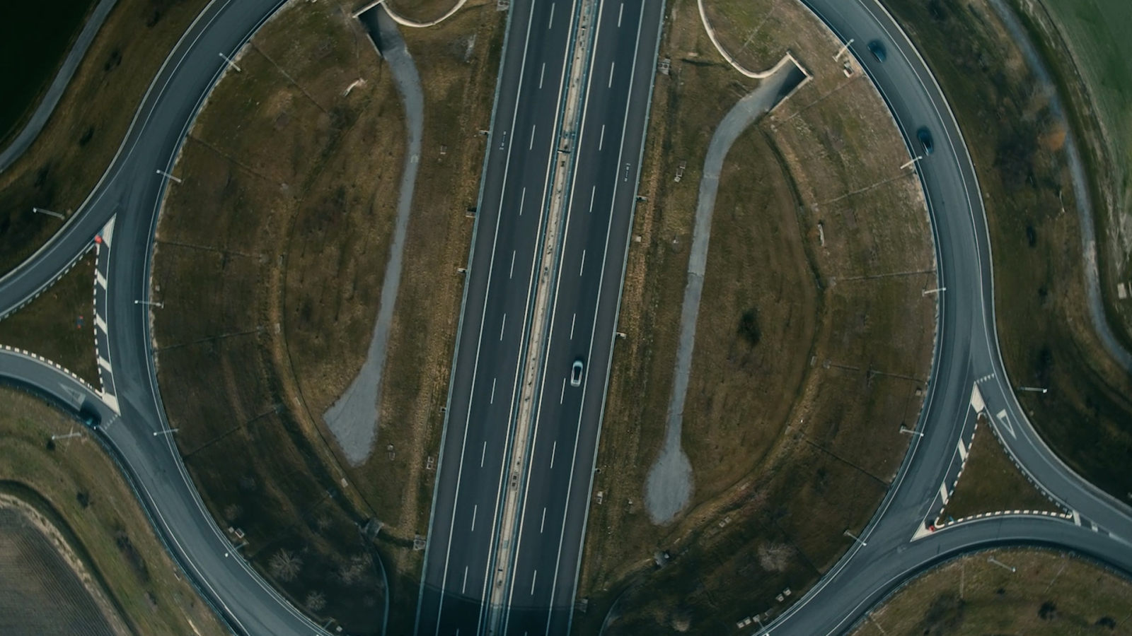
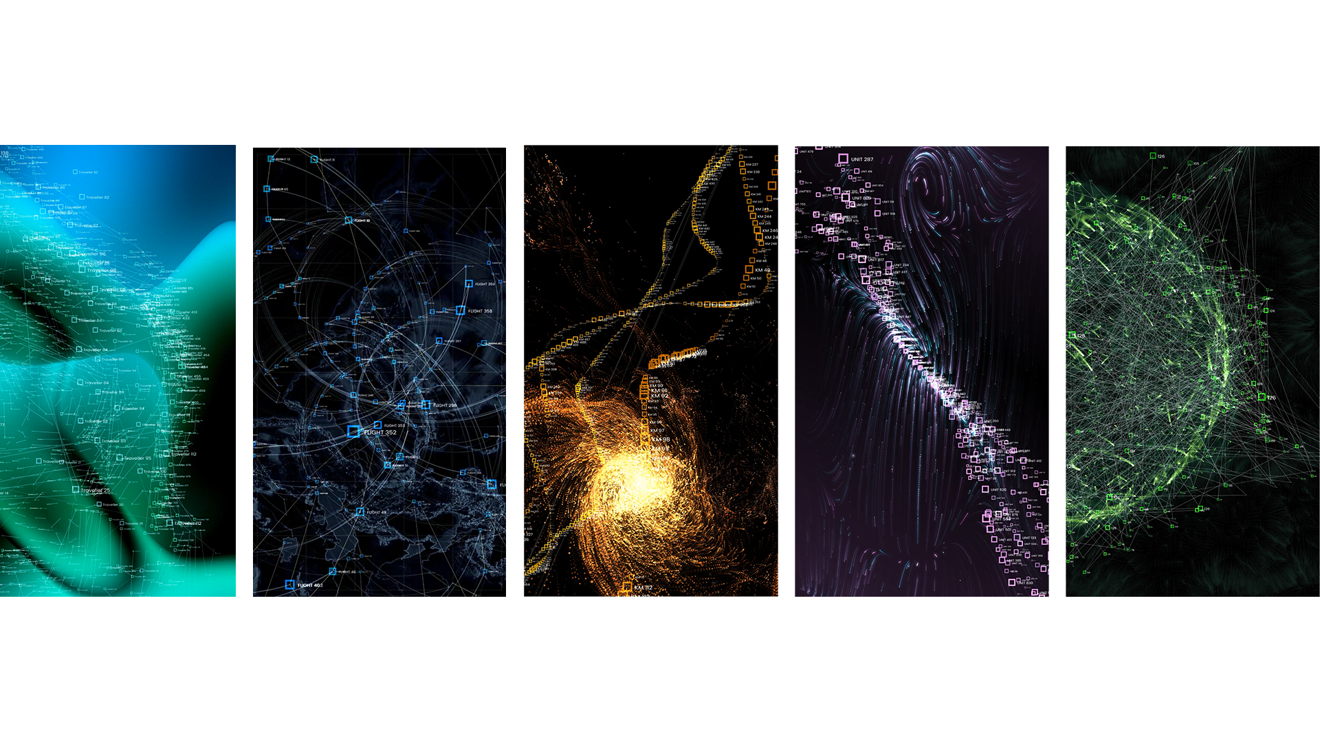
Mundys is a business that manages motorway and airport infrastructure. Its network of services is vital for transportation across Europe and Latin America yet, due to the technical nature of its work, Mundys isn’t widely recognized by the public. Mundys wanted to change that—but describing its complex infrastructure projects to a general audience is a challenge. Thankfully, we came up with a simple solution: showcase Mundy’s impact through intuitive artworks of data visualizations that represent the world of the brand and the insights it derives.
Via Intuitive Data Visualizations we're showcasing Mundys' portfolio of assets where they combine transport infrastructure concessions with digital service platforms to provide advanced mobility services for people on the move through.
Swipe
For More!
Drag
For More!
A visually stimulating installation invited quiet contemplation.
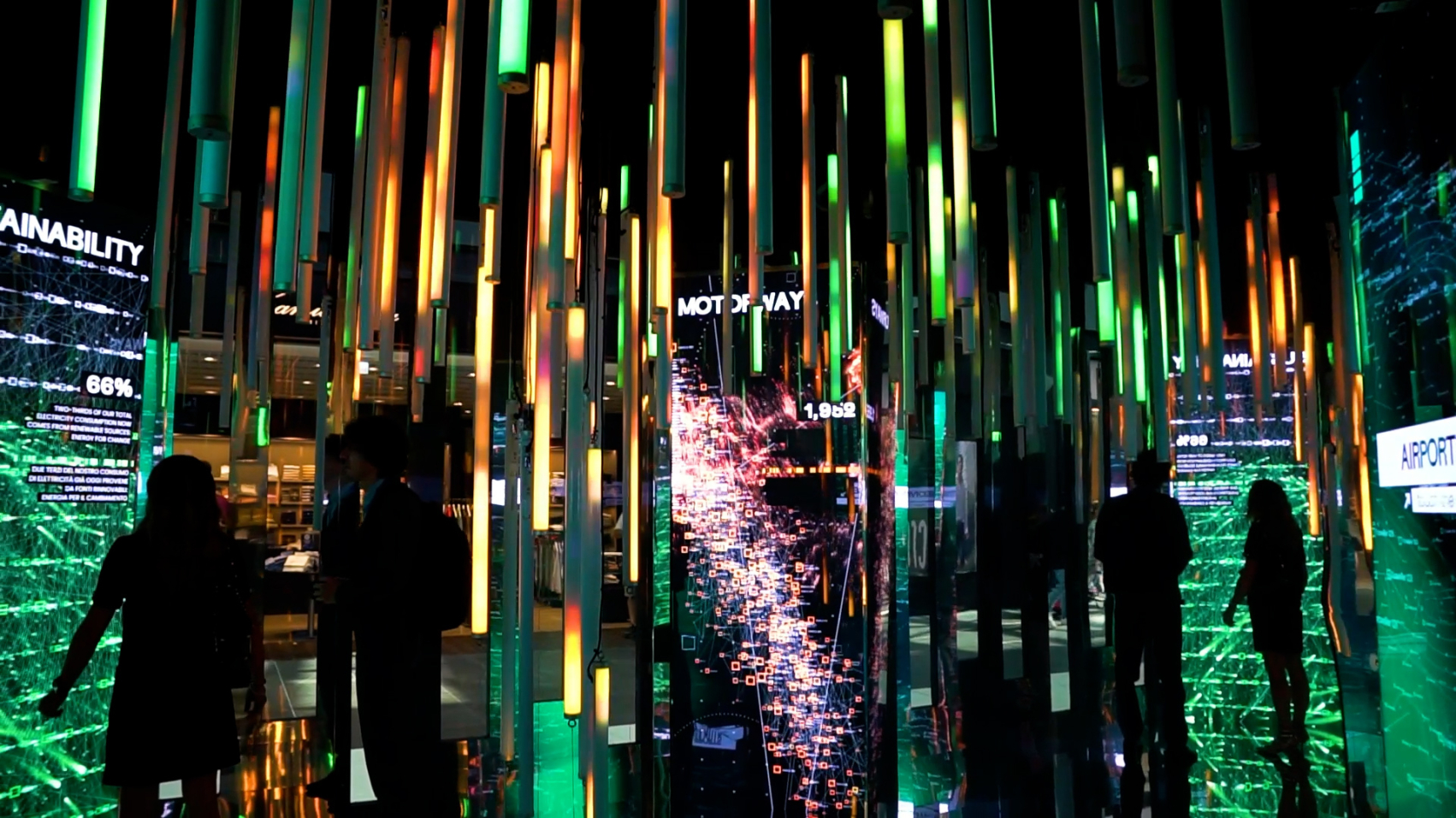
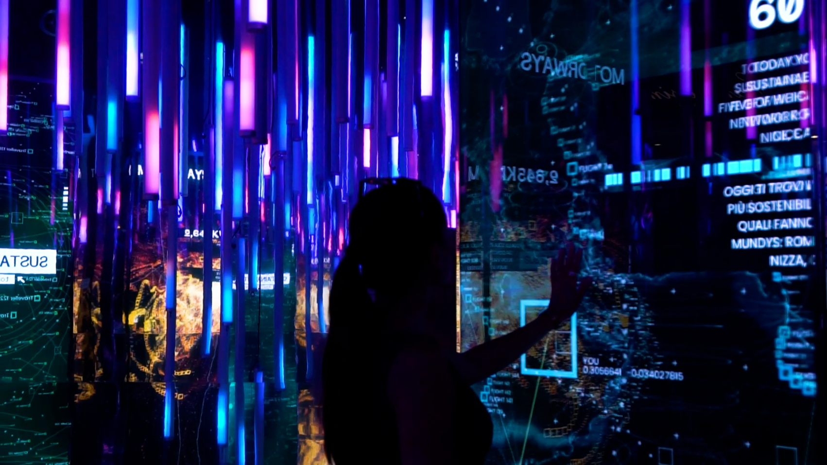
To immerse everyday people in the impact of Mundys’ network, we built a dynamic, immersive installation at Leonardo Da Vinci Airport in Fuimicino called Moving Data. The exhibit took the form of a cavernous, tech-infused tunnel illuminated by the breadth of data gathered by Mundys’ services, presented in an interactive, engaging and digestible way. We organized these interactive data visualizations around four key themes: sustainability, mobility services, airports and highways, allowing visitors to explore the subjects that most interested them.
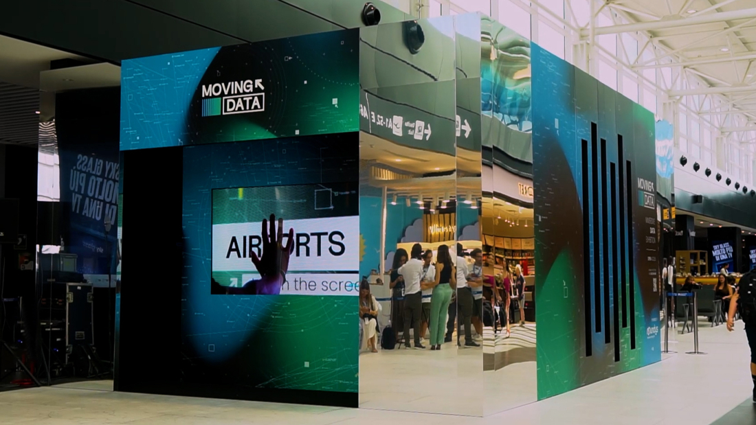
00:00
00:00
00:00
Bringing sustainability home through relevant impact data.
Recognizing that sustainability would resonate strongly with the international audience it aimed to reach, Mundys strategically focused on this theme. Through visualization, the installation translated technical and sustainability-related information into a comprehensible, appealing language for a general audience. We further made these insights relevant to airport visitors by including information on the environmental impact of various forms of travel (for example, vehicles on the road at any given moment) and even more granular data, like the number of coffees sold at the airport each day.
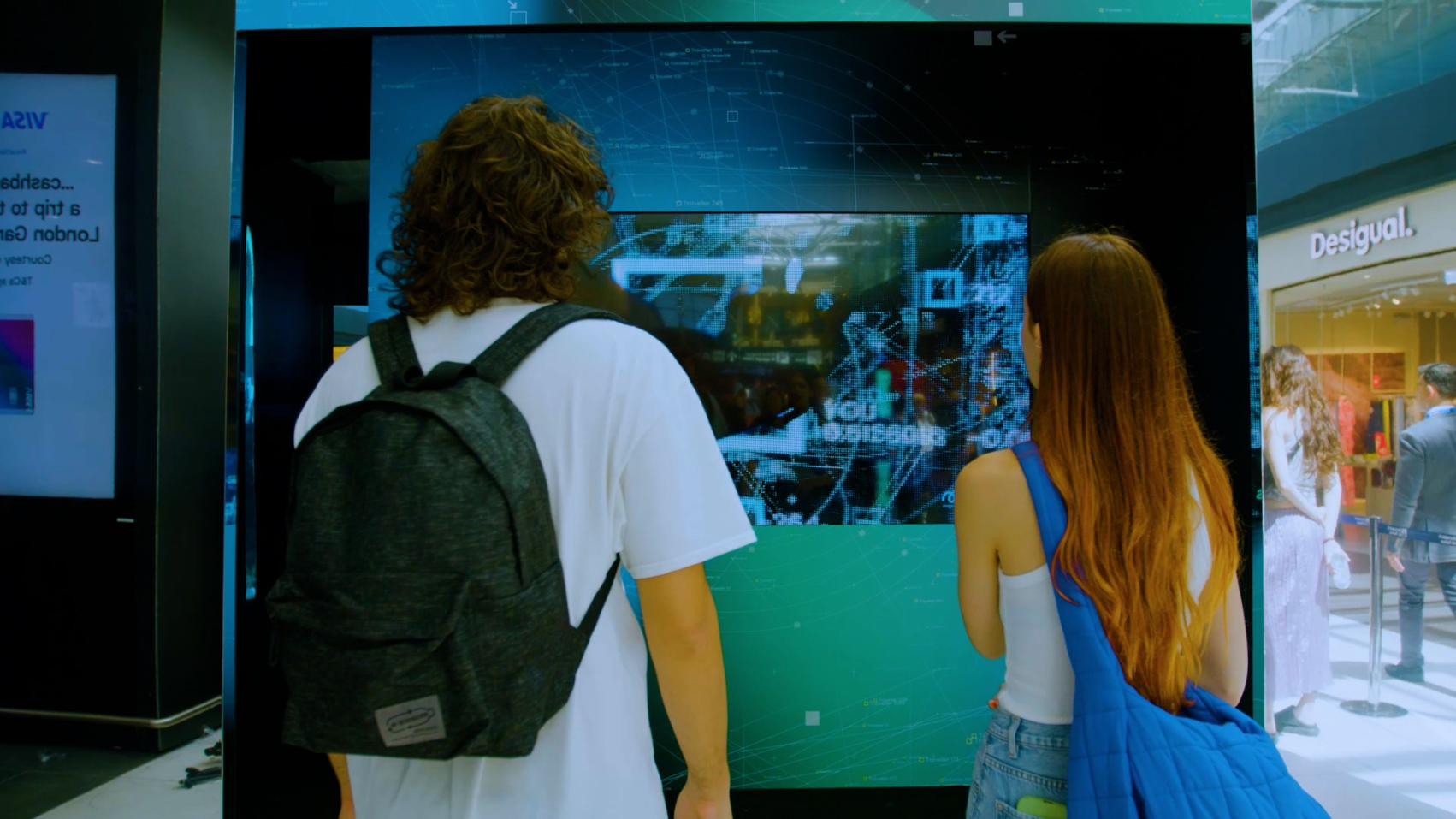
Visitors could further zero in on data most important to them through interactive elements. After a visitor selected a topic, the lighting, music, and colors on displays changed to show data linked to that specific theme. The chance to engage directly with data helped visitors build their own understanding of Mundys' services, including the cutting-edge technologies and responsible mobility practices the business used to overcome key sustainability challenges.
"Visitors engage with sustainability data at Mundys' airport installation, gaining insight into responsible mobility practices."
Storytelling success: finding beauty in data.
It’s easy for data to seem cold, emotionless and unexpressive. Yet hidden within the numbers lies beauty. Our approach to brand storytelling reinforced the notion that data could provide a memorable experience for a subject that, at first glance, may not have seemed too exciting. Furthermore, by translating technical data into intuitive and easily understandable information, the installation successfully educated and raised awareness about themes like environmental sustainability and mobility—and the role Mundys plays in achieving a more sustainable future.
Social engagement
The event has seen nearly 50 thousand interactions.
Drag
For More!
Results
-
Over 42,000 interactions
-
866,000 social impressions
-
30.7% interactions linked to sustainability

