Turn Over a New Leaf with a Revised Brand Style Guide
Turn Over a New Leaf with a Revised Brand Style Guide
Has your design fallen out of style? Get the year off to a good start by taking stock of your brand identity and preparing for new opportunities by updating your style guide with a digital-first focus.
From redesigning a website to pivoting to video, forward-thinking brands are always looking for opportunities to reinvent themselves or try something new. But before making such a big move, brands must take a long, hard look at their identities and how they put that face forward. Devising a brand guide is a great first step to this: you might think of it like a style guide, but one that includes guidelines beyond just visual design (things like brand voice, interactive elements and more). With a solid brand guide in place, your organization becomes more flexible and adaptive to whatever the future throws at you.
Prioritize Interactivity
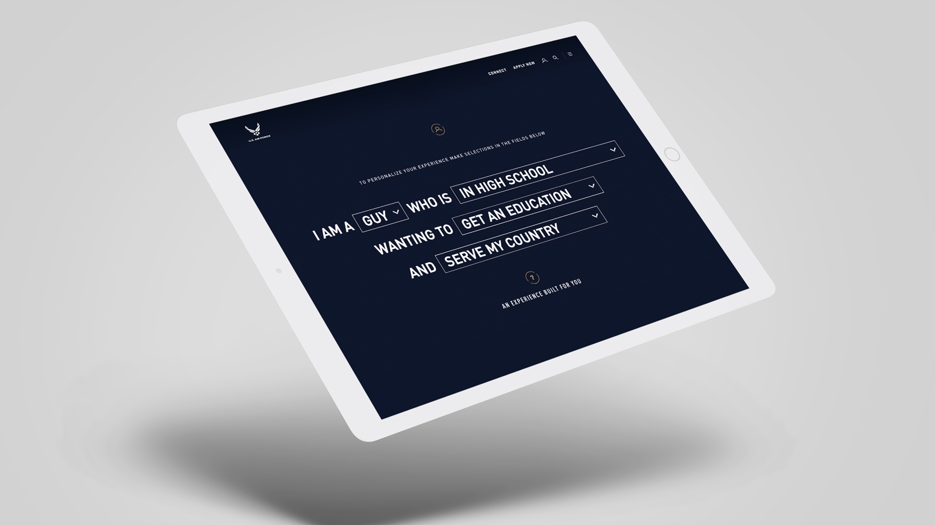
With the ever-increasing importance of digital, it’s essential that you consider how interactivity fits within your design philosophy and to integrate that into the brand style. Interactions should augment and build upon the user experience—for example, allowing users the ability to expand or ignore content for usability.
And that’s really what the challenge boils down to: the push-and-pull in a sense of brand ownership on today’s digital platforms. Organizations will find themselves beholden more and more to fitting themselves within the overall visual or functional designs of third-party platforms (like a social media profile, which ironically is designed for users’ identities to shine through), requiring them to remain flexible in how they present themselves. Don’t fall out of fashion by losing sight on new possibilities afforded by today’s digital platforms. Instead, treat your style guide with a sense of flexibility that can accommodate those innovations for a better user experience and stronger identity.
We bring a mirror into the room and show companies how we see them.
We were fortunate enough to help Viacom develop a punchy, new corporate website right when they were in the middle of launching a rebrand. Corporate websites often play it safe, but we wanted to make Viacom’s site just as much fun to explore as Viacom’s networks are to watch, which often push envelopes with a playfully rebellious attitude. “We bring a mirror into the room and show companies how we see them,” says Rogier van Orden, Operations Manager at MediaMonks. A big part of this process was to highlight Viacom’s massive library of great content.
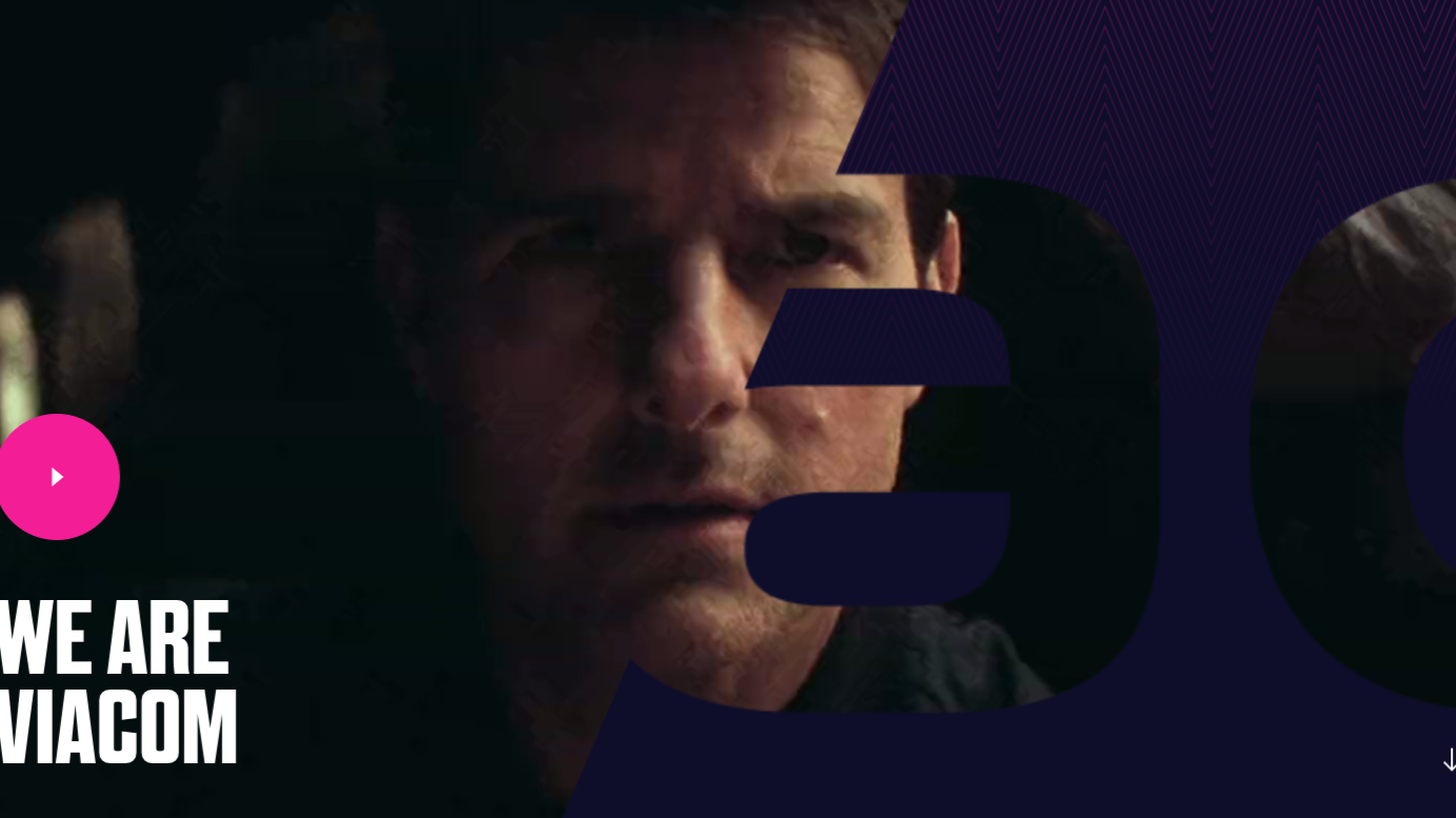
To achieve this, we implemented several fun interactions and tactile elements into the design. We call this “cherry content,” named after the “cherry on top” of a cake or sundae: the small thing that makes a lasting and important impact on the overall experience. This unobtrusive content serves to prove and support the value proposition that brands put forward, allowing users to choose to scroll by or dive deeper by interacting with it directly. Brands will have to consider how cherry content can integrate into other marketing efforts in the digital experience—for example, content users interact with could help you personalize the content they see—or support the types of interaction the brand offers.
Be Bold, but Not Inconsistent
One of the big trends in design is to focus on modern, clean formats that focus on functionality first and foremost without the visual flourish. Consider the abundance of websites built from templates with drag-and-drop elements, leaving us with a trend of clean and uniform sites that all end up looking, well, a bit the same. This results in a “suburbanization” of design: safe, but without personality. “As designers, we almost forgot there’s an identity to portray” says Jouke Vuurmans, Executive Creative Director at MediaMonks, on this trend of clean design. “But bold design and actions are so crucial to digital identity.”
This can be an especially tough challenge for organizations that fit multiple brands within a family. How do you offer a unique design across brands that have their own personalities and audiences? And with the fractured environment of digital platforms—including blogs, social networks, microsites and more—brands of any size might struggle to pull off the balancing act between consistency and having a unique voice. But by taking a more modular approach, you can develop a design framework that remains consistent across your brand family.
Bold design and actions are crucial to digital identity.

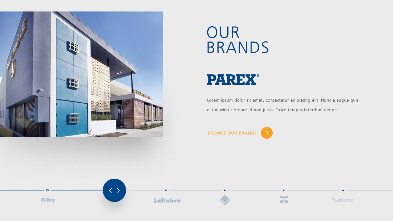
For paint brand Parex, we took a more modular approach that would allow the brand to translate its existing components to other brands in the Parex family. This ensures a level of uniformity across the organization’s digital presence while also allowing some wiggle room for unique design elements and characteristics that help them stand apart.
Be More Flexible
Previously, the style guide was treated like a sacred text: something that couldn’t be messed with. And if it were revised, it would be a big deal. But in today’s environment, things change quickly. New formats and platforms crop up each day, and what works with one doesn’t necessarily work with another. For example, is your signature font legible on each platform offered? Every new format should prompt a revision to your style guide, so don’t be shy about shaking things up. This flexibility also helps in opening the brand up to collaborative opportunities or for streamlining your content across platforms and local markets. This includes transcreation for regional-specific campaigns or assets at scale.

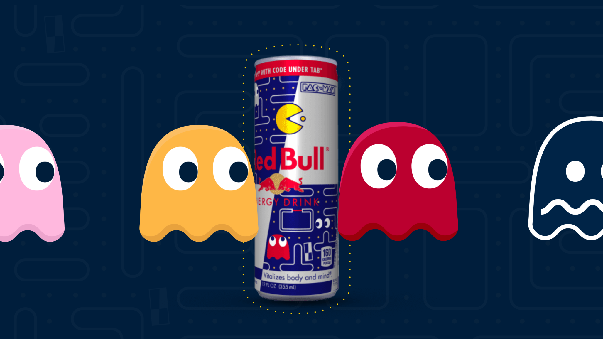
Few mascots are as classic or identifiable as Pac-Man, the iconic, pie-shaped arcade character known for gobbling up pellets in an eternal chase from ghosts. When Red Bull collaborated with Bandai, who retains the Pac-Man IP, we created a microsite for the campaign to celebrate the partnership in a way that payed homage to the character’s roots. On the website, we implemented tactile elements that invited users to navigate the character through the content just as Pac-Man navigates a maze in the games he calls home, marrying game-like elements with the typical actions you would encounter on web platforms. To be fair, Pac-Man is no stranger to reboots and redesigns, though it’s easy to imagine how other brands might be more guarded about how they—or even partners—might handle their IP.
brand guidelines brand style guide design style guide web design digital design

