Choose your language

Choose your language

The website has been translated to English with the help of Humans and AI

Dismiss

How to Curb the Content Deluge on Enterprise Platforms

How to Curb the Content Deluge on Enterprise Platforms
AI AI, AI Consulting, Platform 4 min read
Profile picture for user mediamonks

Written by
Monks

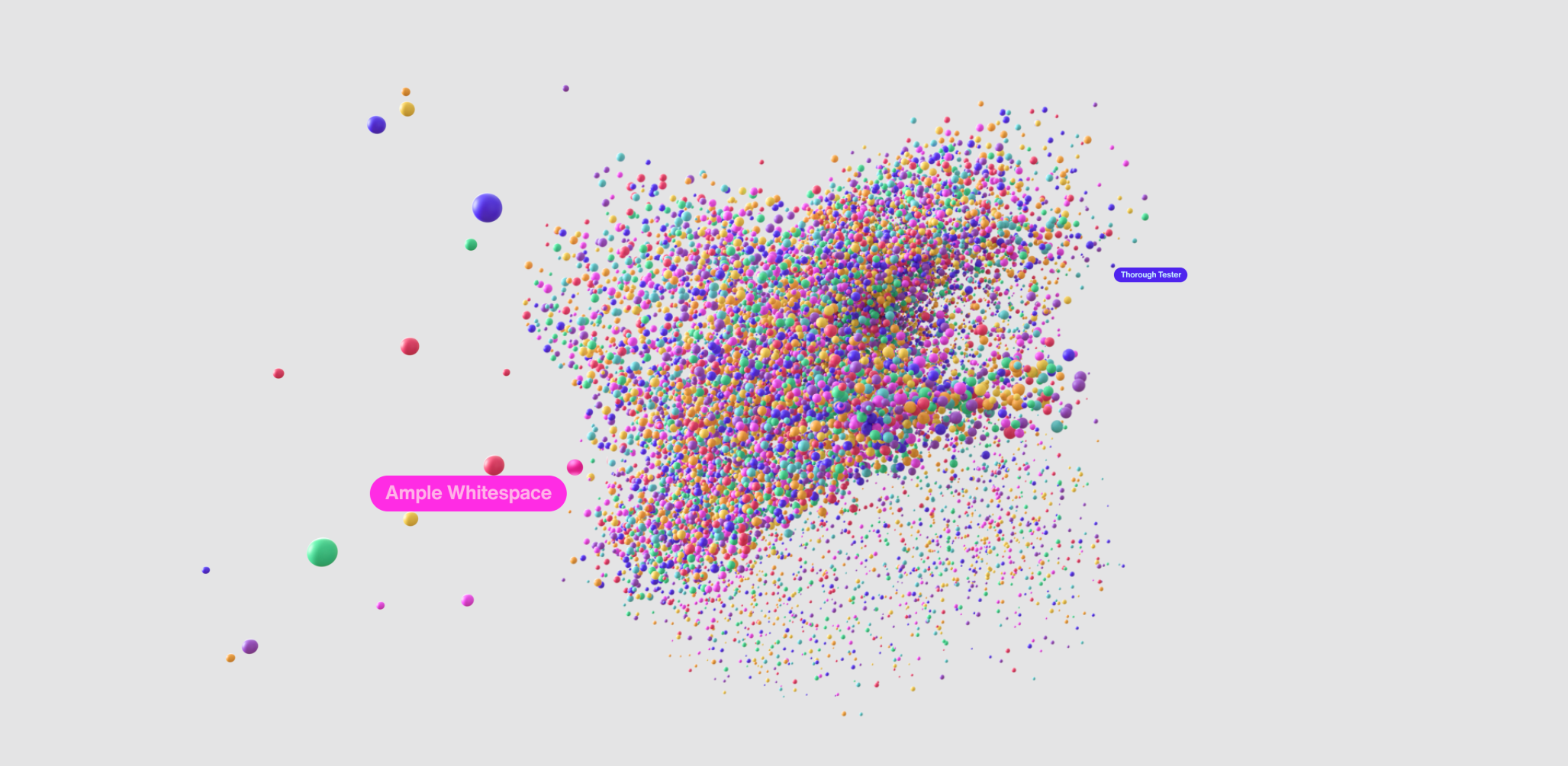
A bunch of colorful dots swirling together

When it comes to a corporate website, quality over quantity can make a big difference to the user experience. Sure, an enterprise will have an excess of content across its various products and sub brands, each designed with different audience personas in mind. But for users—or even development teams preparing for a platform refresh—sifting through all of that content can be daunting.

Organizing content in a way that is easily navigable and actionable is crucial in developing a strong user journey—even more so for a corporate platform that exists to inform. “When it comes to companies that have so much existing content and information, how do you organize that massive number of things to say—and make it personalized and easy to find?” asks Group Creative Director Niels Dortland. The challenge lies not in representing the breadth of information available, but rather pushing users to the right content to act or purchase.


From microsites to enterprise platforms, our platforms team has worked with a wide variety of brands to implement new content management systems, design personalized journeys, and improve accessibility—and finding the right way to surface up key bits of content out of a massive library is key to each of those efforts. Here’s a look inside how the team did just that for Jacobs, an engineering company whose portfolio touches design, construction, consulting and maintenance across a wide range of industries around the world.

Overcome the homepage turf war.

What causes the content overload that is so common on corporate websites? “Everyone wants to say everything, so everything is on the menu,” says Fernanda González, Group Experience Director. That might be a welcome sight at an all-you-can-eat restaurant, but not so much when searching a website for information you need.

The maximalist approach is often the result of intra-political clashes between different business units. A company is a bundle of different teams with different goals and responsibilities, and it’s a reasonable expectation that each should be equally represented on the website. But the primary focus should be on understanding the different types of users who will visit the website and how to account for their needs. 

“What will get people to move forward, and how do we mix those things together into a good user experiences?” González asks, reasserting a user-led approach to content management. Our team’s solution: deliver dynamic content based on each individual’s needs, meaning no one is scrounging for homepage real estate.

Monk Thoughts We offer functionalities that don’t compete with one another and service different users.
Fernanda Gonzalez headshot

Tap into off-the-shelf solutions to make content easily searchable.

One way to move past messy menus and overwhelming content feeds is to put search front and center, helping visitors access the content they need in just a few keystrokes and clicks. For Jacobs, we implemented an AI-powered search engine that greets visitors by asking what they’re looking for. The sophisticated language model lets users answer in plain English, rather than strings of SEO-ified keywords.

The model also made search far easier to implement than a traditional engine, as natural language processing bypassed the need to index and structure data across Jacobs’ existing content—a lengthy and meticulous process that can stretch development cycles across months. “Many other search engines on websites like this need to be very structured with keywords,” says González. “Instead of that, we implemented a smart one that learns to search for content as quick as possible.”

The team further sped up development by choosing an existing search solution, rather than build one from scratch. “Taking tech off the shelf is smarter for brands because it’s faster,” says Dortland, compared to the work of big consultancy firms who easily get tied up in assessments, planning and processes instead of execution. This resourceful method of spinning up solutions means we can make a difference to the user experience now versus a year down the line.

Not only that, off-the-shelf tools are also backed by dedicated development teams and robust documentation should the need for troubleshooting arise. And that’s just the beginning, because as users browse and search around, the platform becomes more aware of their needs, employing a feedback loop to help enhance the user experience with speedier, more accurate results.

Take a cue from social media to make content actionable.

Easily finding content is one thing, but what should users do with it once they’ve landed? “We realized that people want to save content, so we activated that in the user journey,” says González. As users browse content, they can save it to their favorites board—a lot like saving creative inspiration on Pinterest. 

“You can shape boards around different topics of interest, and this lets you use the website more as a utility to gather information,” González adds. In addition to letting users build their own boards, the platform also curates topic-specific boards that pull content from both the CMS and social platforms like LinkedIn that are always changing and always relevant to provide a unique experience for every user.

Put accessibility at users’ fingertips.

A social-inspired interface is one way to make content easily accessible to users. But platforms should also comply with Web Content Accessibility Guidelines (WCAG), which a legal requirement in many parts of the world. Accessibility works best when it plays a key role in the design of an interface—not as an afterthought—and we went beyond Level AA compliance for Jacobs by also implementing a configurator that lets each user create the optimal viewing experience for themselves.  

Options include a reading mask—which creates a focus area on the screen that follows the user’s cursor, blocking out distractions—and the ability to turn off animations and motion graphics. The result is a platform that’s not only personalized in the sense that content conforms to a user’s interest; the interface itself adjusts to their needs. Both result in a more intuitive journey across the entire Jacobs brand story.

Keep up with solutions as technology evolves.

Building a state-of-the-art platform doesn’t mean spending years reinventing the wheel. Nor does trudging through a library of legacy content to make it easy for modern visitors to search and navigate. Rather, tapping into existing, modern tech solutions can help overcome hurdles that hamper the user experience—and do it fast.

Monk Thoughts We need to be knowledgeable about where a brand is at in their digital maturity, what are the tools they are using, and what existing technology we can play with to make the experience better.
Fernanda Gonzalez headshot

As new technologies emerge—hello, generative AI—platforms and user journeys will continue to evolve, underscoring the importance of a partner who can identify the shortest path to success among them. Remember: platforms are always evolving, meaning there’s never a shortage of options to streamline user journeys and make content more accessible.

Learn how our platforms team builds customized solutions to design intuitive, personalized journeys and improve accessibility based on our work with Jacobs. content platform platforms UI design content personalization Platform AI Consulting AI

Pave the Path to More Personalized Learning and Lessons with Edtech

Pave the Path to More Personalized Learning and Lessons with Edtech

5 min read
Profile picture for user mediamonks

Written by
Monks

Pave the Path to More Personalized Learning and Lessons with Edtech

In many places around the world, learning disabilities and impairments often go undiagnosed due to a lack of resources and access to facilities that test for them. But when missed, learning disabilities or color blindness can oftentimes discourage children from participating and excelling in class–sometimes eroding self-confidence in the process, which in turn can lead to far-reaching difficulties later in life.

But technology can help bridge the divide in communities where traditional testing isn’t scalable or accessible to students—so when children’s multivitamin brand Pharmaton Kiddi wanted to impact kids’ lives through technology, MediaMonks’ innovation team sharpened their pencils and put their digital skills to the test. The result is an assessment designed to determine whether students may have one of the learning impairments mentioned above—all while they’re having fun by playing their way through an engaging, interactive digital picture book.

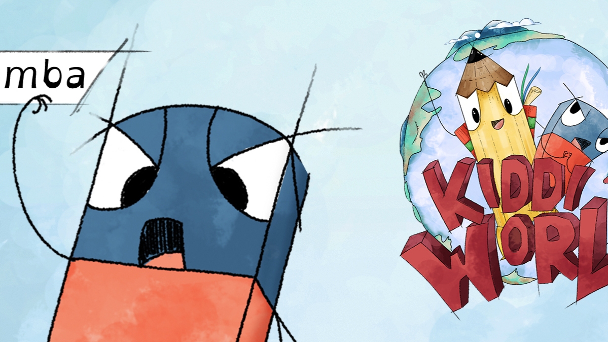
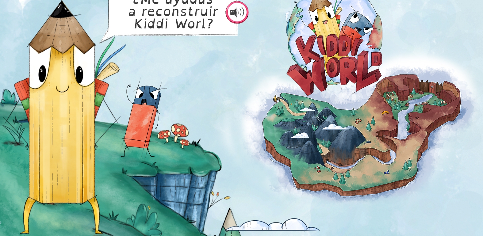
Called Kiddi World, the app takes users aged 9-12 on a journey through the charming World of Words, which is populated with living school supplies and rendered in a charming, painterly aesthetic. Our hero is a sharp, courageous pencil named Lapi in pursuit of Gomba, an irritable eraser whose rampage results in the erasure of parts of the world and words becoming jumbled together. Through a series of visual and language-based activities, kids must erase the prickly eraser’s influence on the world and set things right. The app shows what edtech can achieve through a hands-on approach that brings together data, UX expertise and best-in-class creative storytelling.

01KiddiWorld

Gomba, a rubber eraser and the villain of the story, rubs Lapi the wrong way.

Reducing Testing Anxiety with Under-the-Hood Innovation

“Kiddi World fills an empty space where you can pre-diagnose the child,” says Geert Eichhorn, Innovation Director at MediaMonks. He cautions that it isn’t meant to replace a medical professional’s diagnosis of any impairment. “It functions as an indicator based on professional tests,” he says, prompting parents’ or teachers’ attention if a child is likely to have an impairment.

Through AI, the test can measure students’ legibility with precise accuracy—for example, how much a student’s writing extends outside the bounds of a line. “It’s a matter of determining a percentage of error that allows us to apply some simple rules,” says Luis Guajardo, Creative Technologist at MediaMonks, “to tell teachers to look further into it and check in with the child.”

And that’s a good point; while children can play through the test by themselves (guided by text and voiceover instructions that lead them through timed exercises), the app doesn’t signal a reduction in the teacher’s role. Instead, it gives teachers a tool they can use to help them understand how individual students process information differently. They can apply this knowledge to how they educate their students—like making a customized lesson plan or supplementary programs—to aid in these students’ learning.

With so much happening under the hood, children are free to enjoy the assessment without feeling the pressure and anxiety that comes with being tested. Instead, the experience is designed and built to emphasize a child’s unique journey exploring the world with Lapi.

Monk Thoughts Kiddi World fills an empty space where you can pre-diagnose the child.
Portrait of Geert Eichhorn

One of the more interesting ways the app achieves this is through handwriting recognition, which aids in identifying dysgraphia automatically as students write. Many touch devices, like Apple’s iPad, natively offer handwriting recognition to translate users’ handwriting into print text. This feature is great for extracting meaning from handwriting, like if a user is jotting down notes. To detect atypical writing behavior from typical ones, MediaMonks took handwriting recognition a step further.

“We used an external tool that could measure stroke speed and density, helping us measure if a line was made fast or slow,” says Eichhorn. These variables are key for making a precise assessment for whether a student might have dysgraphia. “We employed a set of rules that identify aspects of dysgraphia that are particularly notorious and can be examined by the app,” says Guajardo.

In addition to native handwriting recognition, the team also had to disable spell check native to iOS apps. If a student’s spelling mistakes are corrected as they go, it would impact their score—an obvious, but easy to overlook, barrier to accuracy. “Instead, we use an API that determines if what a student has written is a real word, or close to a real word,” says Eichhorn.

Building Immersion Through Design

The tech under the hood is remarkable, but the designs on the surface of the experience are what bring Kiddi World to life. For every action, students write or draw something on the screen, adding to the sense of engagement as they make their mark—literally—on the story’s world. This is why the user’s avatar is a pencil: Lapi reflects the everyday tools that students use in class.

Monk Thoughts The app can measure stroke speed and density, helping us measure if a line was made fast or slow to aid in making a result.
Portrait of Geert Eichhorn

Narrative is ingrained into each of the challenges that kids must overcome in their journey through the World of Words. First, they’re tested on color blindness: Gomba has erased a path through the land, so readers have to draw it back by tracing a line that cuts through a pattern commonly used in tests to determine the type and intensity of color blindness that one might have. Users complete this challenge by drawing a series of segments of the path, which then come together like comic panels to create a full scene.

If a student is color blind and therefore can’t see one or more paths, they can simply skip that segment. This way, students aren’t penalized for something they can’t control, which is critical to how the assessment is designed and progresses. No matter how students respond or interact in any of the exercises, results aren’t telegraphed to them nor do they affect the narrative. Instead, results are saved in a report that’s delivered to the teacher upon each test’s completion.

Eichhorn notes that the narrative is constructed in a way that gives students a real sense of progress. “In the first chapter, students are working with Lapi to respond to what Gomba has already done,” he says. “In the middle, they’re about the same level as him, and in Chapter 3, they’re ahead of him and trying to thwart his plans.”

04KiddiWorld

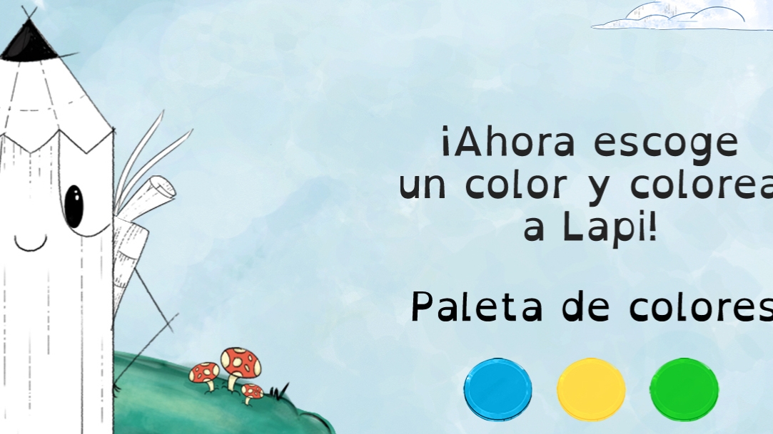
The onboarding process gets the test off to an exciting start, inviting kids to color in Lapi however they like.

The flow (and lack of scoring interrupting the narrative) ensures students feel confident and empowered regardless of difficulties they face in the assessments—of which there are a variety. “A lot of testing is required for accuracy,” says Eichhorn. “We found that we needed maybe six times as much information than we originally imagined to come to a reliable and accurate result.”

Still, the team was able to deliver the necessary assortment of tests seamlessly integrated into an engaging narrative—a good test for partners who understand both tech, user experience and visual design. From responding to a direct regional need and offering a familiar and engaging narrative experience, Kiddi World shows that innovation doesn’t have to come at the cost of usability or accessibility. In fact, it can help us facilitate better accessibility to users who need it.

Tools like this can have a profound impact on education—not just by aiding students who might have one of the tested learning disabilities or color blindness, but by initiating more personalized educational plans. By providing measured feedback on how students process information, edtech like Kiddi World enable closer, one-to-one connections between students and teachers, helping them identify the best individualized approach to enhance a student’s learning.

Aiming to make testing for learning disabilities scalable for schools and stress-free for students, MediaMonks built a story-driven assessment employing technical innovation and best-in-class digital design. Pave the Path to More Personalized Learning and Lessons with Edtech We put ourselves to the test in finding a new way to pre-diagnose learning disabilities, paving the path to more personalized educational experiences.
Innovation UX design UI design digital narrative digital stories edtech education health pharmaceutical iPad children kids students

Choose your language

Choose your language

The website has been translated to English with the help of Humans and AI

Dismiss